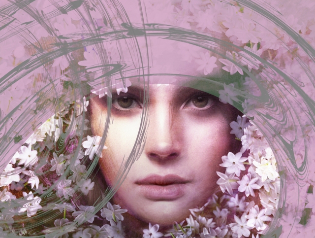
Chiaroscuro
I have been working on a piece for Roxana’s new perfume called Chiaroscuro. This is a fragrance for those who love oriental amber perfumes, jasmine and patchouli. The term Chiaroscuro comes from Italy, referring to the tonal contrasts suggesting volume and modelling of the subjects depicted. The perfume starts dense and dark but with time the composition gets lighter.
My concept for the art was to look at the progression of the scent from dark to light and use the jasmine flower as its focus. Hence the wearer of the perfume emerges from the dark qualities of the perfume through a tunnel of jasmine.
The piece started out as a drawing on paper, was scanned and brought into Photoshop.
Subtle photographic elements were added to the face, flowers of jasmine from our garden were used. Chiaroscuro #1 was the first manifestation of this vision.
Then design elements based on the letter “C” were placed around the head creating more energy and movement. Chiaroscuro #2 was born.
Other variations with type and the perfume bottle were added to create the final version of this promotional piece for a remarkable scent. Stay tuned to vote on the final images soon!


